Artwork stories
Distribution
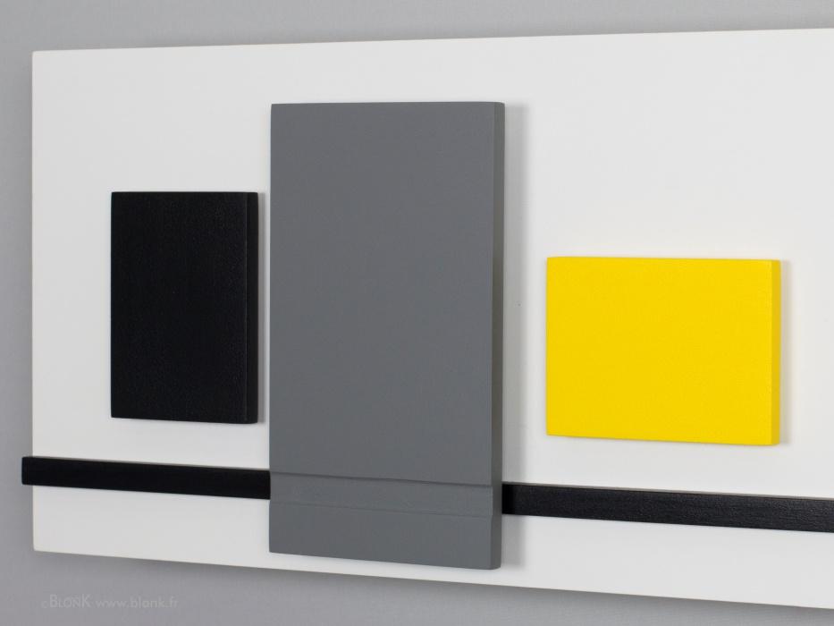
 This artwork is not a scaled model of a factory.
This artwork it the fruit of a a spontanious creation.
I randomly placed objects with different forms on a board until I estime that there is a certain balance. Everyone is allowed to see what he wants. When the work was finished I imagined that it could be some kind of distribution site where liquids are stocked in in reservoirs and transport them from here through pipelines. That's why I gave it the title "Distribution".
Perhaps you noticed the allusion to the famous shoes with red soles and heels by 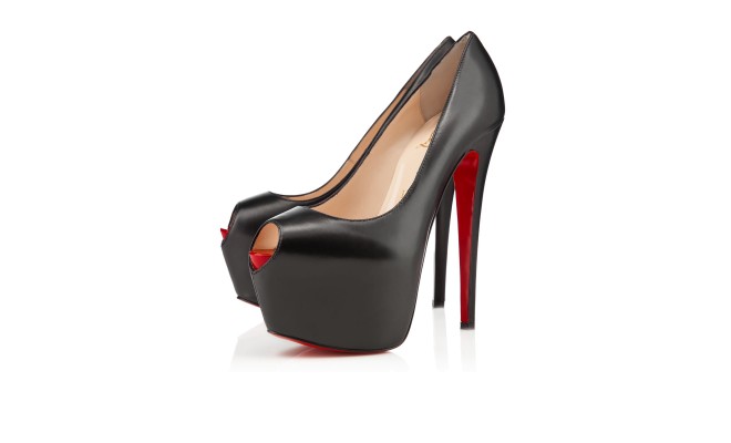 Christian Louboutin (www.christianlouboutin.com).
Yes, I wear them quite often!
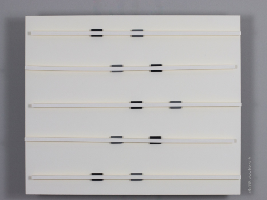
Dreams

Flyover
For me the beauty of this work lies in the subtile games of colors, lines, shadows and optical effects.
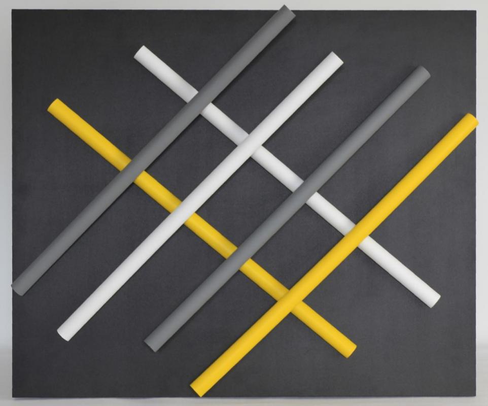 When I'm standing right in front of this 3-D painting at a few meters distance, I admire its pureness and I want to decrypt the positions of the differents sticks. In my head I feel the need to try other positions. I remember to have done a lot of simulations when I created the artwork and that a minor change in position would make the work less interesting.
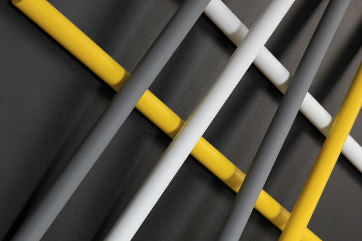
When people get nearer to the artwork they discover that this painting is not flat. Some of the sticks are "floating" and create beautiful shadows.
When I was young a simple round-a-bout near The Hague was transformed into one of the biggest motorway crossings in the Netherlands were motorways cross over 4 different levels. We called it the fly-over. A little bit like in this artwork.
Geom Flecken
In my opinion an artist always has to be on the road to something new. Fortunately I have enough ideas that wake me up early in the morning! One of the latest flashes I had was about letting the paint flow on the painting in a more or less controlled way.
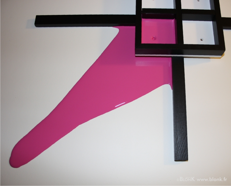
Here is "Geom Flecken" in the making. At the centre of the painting (the right upper corner in the picture) I placed, lifted from the surface, a square divided in four compartments. The pink paint dripped down through a hole and dispersed over the surface underneath.. The finished painting contains 2 pink and 2 grey stains, almost geometric.
Creating an artwork like this is not without risk but life would life be boring without taking any chances!
![]()
Hang Around
In 2013 when I started I as an artist I wanted to make mobiles.

The master in this field is ofcourse the american painter and sculpter Alexander Calder who died in 1976. His work is so powerful and original that I frightened me more and more to go into this direction so I put the idea of making mobiles on ice. Out of the question to copy, if I would make mobiles than they should be in the BlonK style, nothing else.
And then I had this idea of a hanging object, not really a mobile but an approach. And here it is finished, my first "Open Space" artwork titled Hang Around.
It can be suspended to the ceiling and used to seperate different parts in a big room or office (kitchen/dining room, office/meeting room). The artwork has two differents sides.
Hip To Be Square
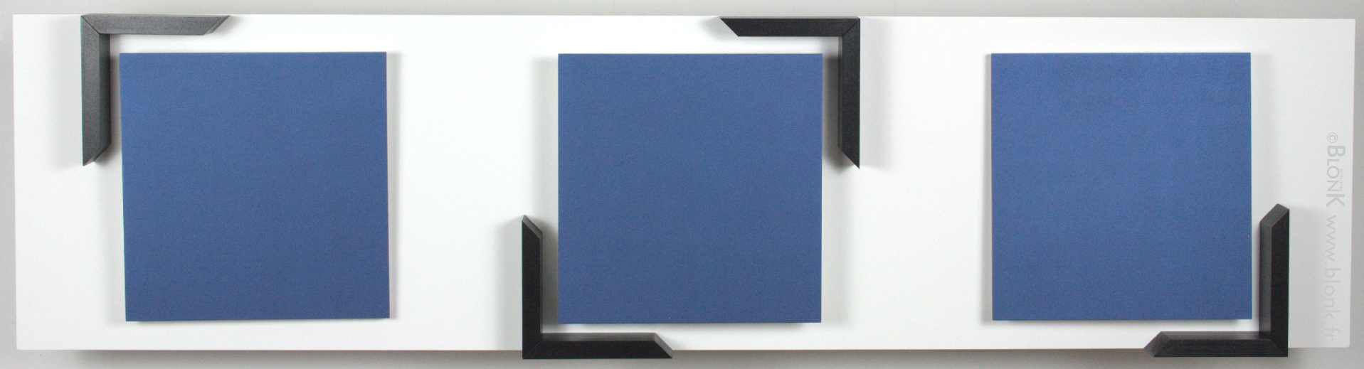
This three dimensional painting is quite big and the first out of a series of paintings in the landscape format. It has three squares painted in black-blue that come loose from the background which is something you will not notice from a distance. The left and right squares are also inclined to the top or the bottom at an angle of about 5°.
When I looked for a title to fit the artwork I decided to go for "Hip To Be Square". I don't know if you heard it before but Huey Lewis and the News released a popsong with the same title in 1986 (see video).
The song deals with tendancies, with what is 'in' or 'out'. Things that were oldfashioned have become popular again. It can even concern human behaviour (hippies that became yuppies many years later is a very good example).
Let's conclude by saying that squares are really in fashion this week! You need to have some in your home.
Kohlenheizung

Leaving Town II
Don't you feel the need from time to time to breathe in some fresh air at the countryside? If so this painting might be something for you.
It's very pure and simple. To my opinion there is nothing more to add. The first version of this painting (already sold) is smaller and has less depth. It is part of a series in the landscape format with a line as the main theme. For me it represents the city at the left of the painting and the road that will take us away from this human anthill.

A person who visited my booth at the art fair in Lyon, France told me that it made him think about the cartoons "La Linea" by Osvaldo Canvandoli. Why not! I did not foresee this but the link is very interesting.
What I like about abstract art is that is offers free interpretation and as a bonus it is often timeless.
Logo
![]()
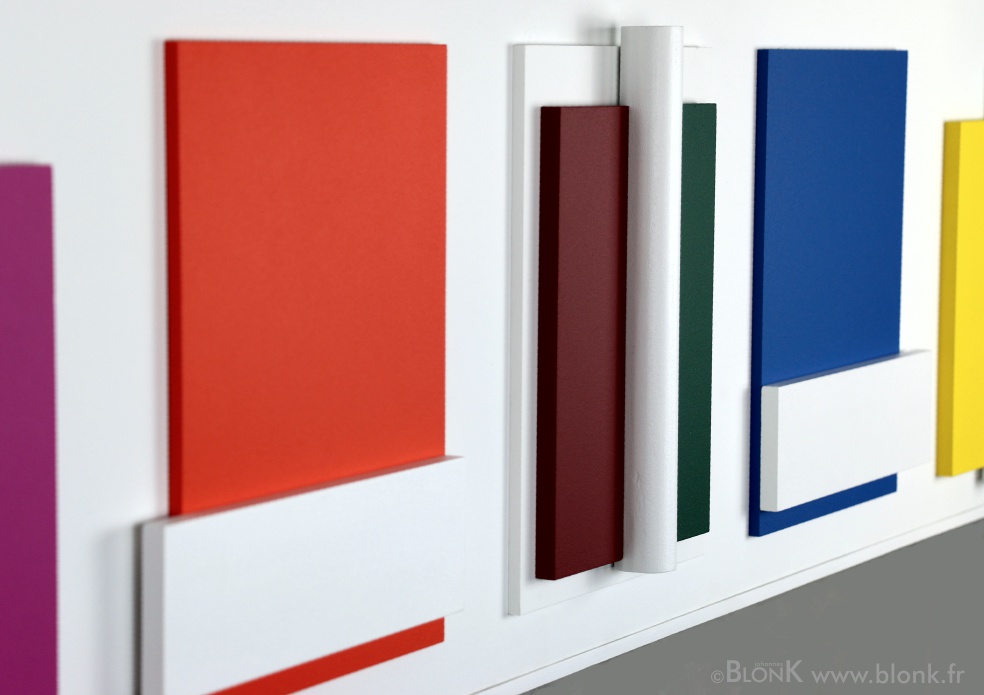
Printemps
This 3-D painting that I will show you now alludes to the freshness of the vegetation characteristic for this period of the year.
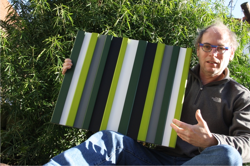
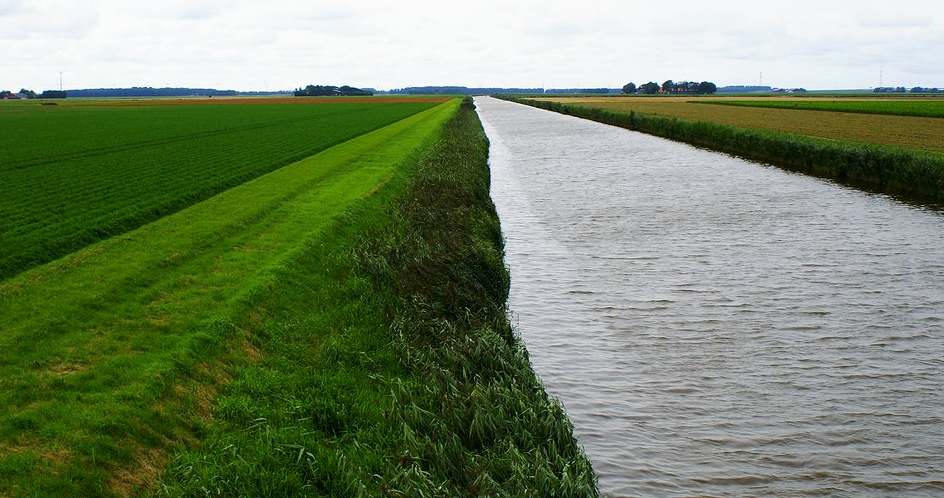
Spring with fresh grass in the meadows, wheat growing in the fields and new leaves on the trees unfolded recently.
This wall assembly also represents the typical landscape of the country were I was born, the Netherlands. You will never forget these ever green meadows mostly seperated by small canals even if you live abroad for a long time already. You can travel in the crowded part of the country (Randstad) between the big cities and suddenly find this landscape on your right and left with cows and windmills of course!
Stelt Orange

Strak
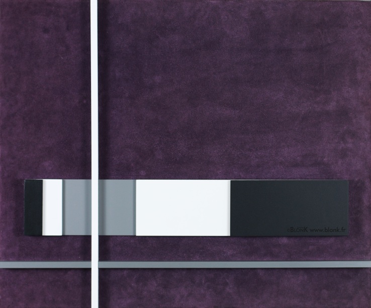
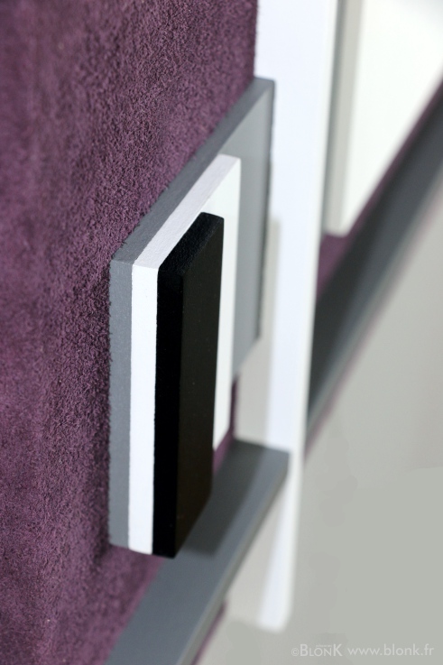 This 3D "painting" or wall-assembly if you prefer is called "Strak". It is quite particular as the entire background is covered with purple tainted leather. In fact I used the inner side of the skin which is better known as suede.
The leather I used creates a very warm ambience to the painting and touching it is a real pleasure. Each time you glide you finger over the surface the hairs bend over in another direction changing the aspect of the background.
The creation of this artwork started off with the leather background which traced the framework of the painting. For the first time I used the computer to design the other elements in white, grey and black and all made of wood.
My favorite color is purple but so far I did not apply this color very often in my paintings and sculptures. The next and very special artwork that I will present you here will show you that a change is coming.
Follow the artistic adventure of your favourite artist here by coming back regularly.
See you soon!
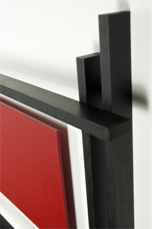
White Shadows
This 3D painting, pure and chic, deserves some explanations.
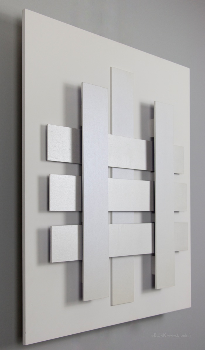
The three horizontal blades each have a different position with respect to the background. They have been painted pearl with a special iridescent paint. The vertical strips were painted white first in order to receive a final coating of interferent, transparent blue paint. The background is painted with more neutral paint (titanium white).
As you see there are only slight differences and all depends on the way they are exposed to light and the angle under which you look at the painting. This artwork is no longer available.
Zen